I made an (overly) fancy plot for a paper that we decided to not include in the paper, as the biological/clinical (why isn't bioclinical a word? bioinformatics is...) implications are unclear, or uninteresting, or both. Probably both.
The data is about 10 patients with transforming cancers. We have RNA from diagnosis and from transformed disease, which range from a few months to many years down the track. One of the obvious analyses you can do is differential expression. You can do this for each patient separately, or you can group up all diagnosis samples and all transformed samples. Doing the grouped analysis yields a bunch of differentially expressed genes, and some are the usual suspects: MYC et. al. Top tables, volcano plots, etc. All good.
The question we pursued but didn't bother to put in the paper was if this DE signal was related to the time between diagnosis and transformation. We already know that the patients on average have the top DE genes change between timepoints (as they came up as DE), but is the DE signal stronger in some patients than in others. A first approach is to take the the top N genes (default FDR < 0.05 I'd guess...), and check the log fold change for each patient. A signal here would be a correlation between the by-patient mean LFC and time to transformation. It'd be tempting to look at things like average log(p-value) to see how significant the genes are in each patient, but we would then bias by power: we would get stronger signals from less noise or deeper sequenced samples, which we don't care about. Using the uncorrected LFC mostly avoids that confounding factor.
Doing that, we do see a bit of a correlation. Unfortunately, the correlation is driven by variation in the transformed sample (the diagnosis samples don't depend much, if at all, on the transformation time). It's a bit unfortunate, as a correlation on the diagnosis side could in theory be used to predict time to transformation when a patient comes in at diagnosis. If you redo the analysis on more than 10 patients that is, and actually test that the correlation is consistent and reliable over several data sets. As it is, the correlation could be nothing more than the effect of the treatments the patient is undergoing.
Now, after having explained why this isn't in the paper, let's move to the subject of the blog: how would you make a figure out of that?
Well, first approach would be to just plot the average LFC by patient over the N significantly up and down regulated (separately ofc) genes, and order the patients by time to transformation. You'd then get a scissors like plot, where the shortest time to transformation have a modest LFC for both up and down regulated genes, and you'd see how they split apart for patients with increasing time to transformation:
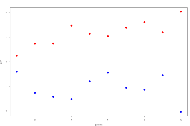
This shows that the split increases as you go right on the plot: patients with longer time to relapse has a larger difference in LFC between the top up and down regulated genes. You can probably do something a bit more exciting though, like showing the variance of the LFC in some way... Box plots for example, with standard deviation and percentiles or whatever would already be a lot more useful. It'd look something like this:

The choice of SD and quantiles are a bit arbitrary of course, and if we want to go the full stretch and show the complete distribution of the LFCs of the top N genes we can always go to violin plots, that are essentially sideways smoothed histograms:

Well, that's the end of that I guess. Or is it?? This blog wouldn't be here if it were, so anyone familiar with the anthropic principle (with the universe replaced by this blog) will realise that there is another step. Also you can see on the scroll bar that there is still some left of the blog. You also haven't seen the plot that was used to advertise the blog (unless you've scrolled down, which you probably have), which is kindof a tell. Anyway, onwards.
Do the most DE genes in the group comparison separate the patients better? Is it better to go down to FDR < 0.5 to get more genes and more power? No reviewer would object to the choice of FDR < 0.05, or even think of it twice, but that doesn't change the fact that the cut-off is very arbitrary.
We can get rid of it if we don't plot just a subset, but we plot the ranking. That is, we plot the violin plot for the top N genes in red/blue, Inside that we plot the top N/2 genes with half width in orange/cyan. And so on. All on top of each other. With just two overlapping violins, you get this:

This shows a bit more information, but it's also messy. Let's start by doing two half-violins for the up and down regulated gene sets. Then do the above violins-inside-violins, but put a gradient from black to red to yellow to white for the upregulated genes, and black to blue to cyan to white for the downregulated genes. So make a continuous number of violins (well, in the computer it'll always be discreet, but small enough steps to look continuous). So the red colour shows the distribution of the largest gene set, and as we strip down the gene set to only the very top ranked genes, the colours shift to brighter colours. You then get this:

It kindof looks like slugs slugging their way up and down a wall, doesn't it? Imagine frames of a stop-motion of a slug movie. The blue slug going down, the red going up. So well, I'm calling them slug plots. :)
At the end of the day, this is a pretty plot more than a useful plot. Yes, it contains a lot of information in the sense that it shows the distribution for any top N genes, but it is not really immediately obvious if you are looking at a significant signal or not. It is not clear where the magical FDR = 5% limit is. You do however see that the higher ranked genes have a stronger signal (the white parts of the slugs climb up higher than the red parts), which is neat.
Anyway, maybe there is a use for someone. Essentially it can be used when you have several DE contrasts you want to compare to a ranked gene list (potentially from another DE contrastt). If you want to make your own slug plots, there is an R package called slugPlot now. :)
library(devtools)
install_github('ChristofferFlensburg/slugPlot')
library(slugPlot)
example('slugPlot')
?slugPlot
It is all a bit thrown together, so feel free to improve or add things if you want.
No comments:
Post a Comment